What’s In a Logo?

Written by frankstudios
A logo is more than an image and words. Your logo is your corporate identity. Your logo relays your vision and establishes consumers expectations when engaging with your brand.
For those old enough to remember, the launch of Apple came with a logo that included Sir Isaac Newton. As Newton was one of the figures that revolutionized science with his discoveries, so Apple’s founders aimed to revolutionize the world with their discovery and futuristic products. Who better to represent the Apple brand than the man who founded gravitational theory from an APPLE falling out of a tree?


Design is not just what it looks like and feels like. Design is how it works.
The first Apple logo (circa 1976) enjoyed a lifespan of 1 year. Steve Jobbs rightfully criticized the first adaptation of Apple’s logo as “outdated” and a “misrepresentation” of their cutting-edge products. The technological products being offered by Apple were intended to simplify our complicated lives. Therefore, Apple’s founders wanted a design that was both simple and modern. The 1977 version is the one we all know and love today, with slight iterations along the way.
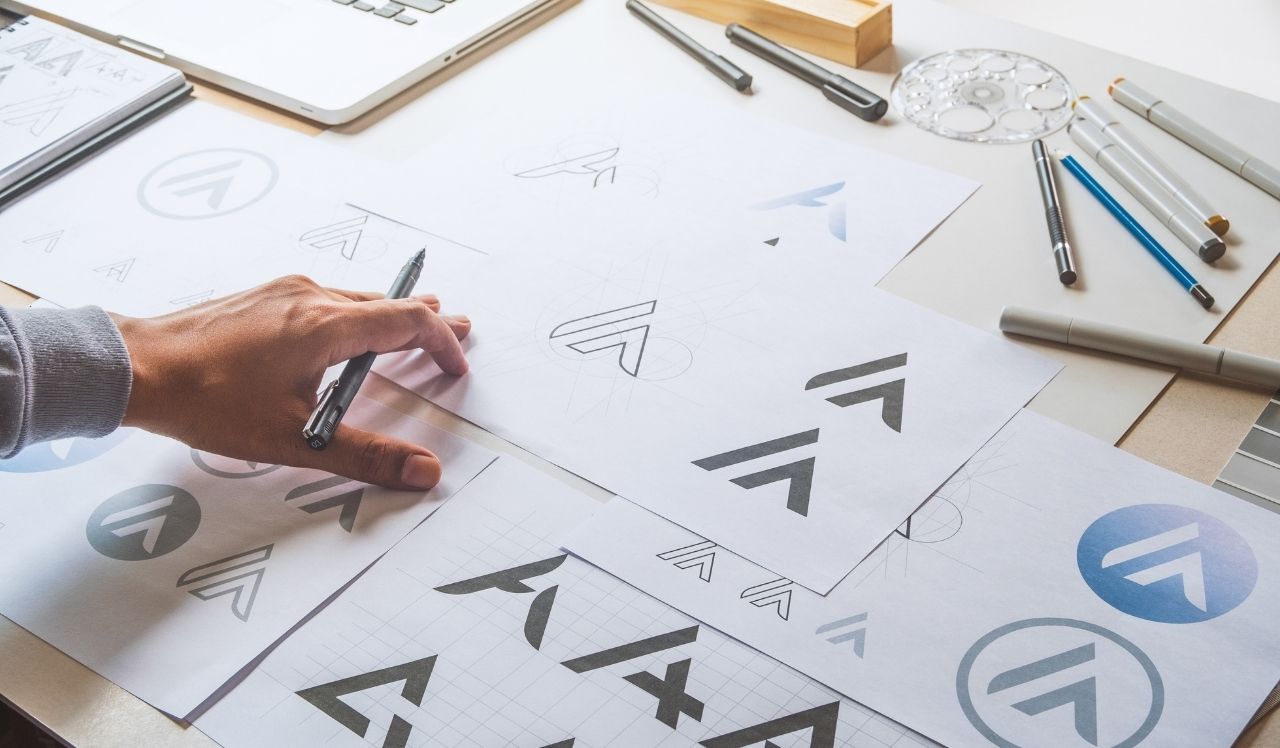
Logo brainstorm session. Conceptual design to determine if logo captures your corporate soul.


Starbucks Two Tailed Siren
The logo was designed to pay hommage to this Seattle based coffee company. Wanting to communicate Seattle’s close proximity to the sea, the siren is seen to have hair that looks similar to ocean waves.
Customer experience was top of mind for Starbucks founders who expressed a desire for their patrons to enjoy a “mythical” experience when indulging in a Starbucks dark roast. The Siren is a mythical creature who lured seaman to their own demise. The notion for ther logo is to make Starbucks alluring by design, beckoning consumers into the store to grab a latte or patstry. “I hope when people see the siren on their cup, of course it’s going to stand for what they’re going to get from Starbucks,” Creative Director Steve Murray said. “If the siren is on that cup of coffee, it’s going to be awesome.”
The Nike Swoosh
With a value of around $34.8 billion, Nike is one of the best-known athletic brands in the world. It’s also one of the most recognizable companies, thanks to its unique emblem.
The swiish image represents the wing of the Greek goddess Nike – the deity of victory. Nike was thought to deliver strength to warriors on the battlefield. The owners of Nike wanted a logo that would resonate with athletes going into sporting events. In addition to the sense of immortality and strength that athletes feel when putting on their Nike gear, the swoosh also implies a sense of speed and movement.
Apple, Starbucks, and Nike are just a few examples of brands that have withstood the test of time. The creative teams ensured the mission, the products/services, and customer experience when using their brand were all included when discovering their brands identity.

Build A Believeable Brand
At Frank D Studios, we will take a deep dive to discover your business ins and outs. We pride ourselves in developing a vast understanding of your products and services, so that we can design a logo that accurately reflects your brand. With our in-depth marketing knowledge and expertise, we quickly identify your unique market opportunities and challenges. Our expertise is applied to developing your brand’s “story”. When you work with Frank D Studios, you can expect delivery of a logo positioned that will define your corporate mission, identify your products/services,and will imply an exceptional customer experience.

Written by FrankDStudios
Related Articles
Related
Frank D Studios Launches New Website
Welcome to WordPress. This is your first post. Edit or delete it, then start writing!
Join
Subscribe For Updates & Offers
Sign up for our newsletter so you won’t miss a beat.
